

Century Laminate Beige 163 LU: Interior Design Ideas & Best Uses
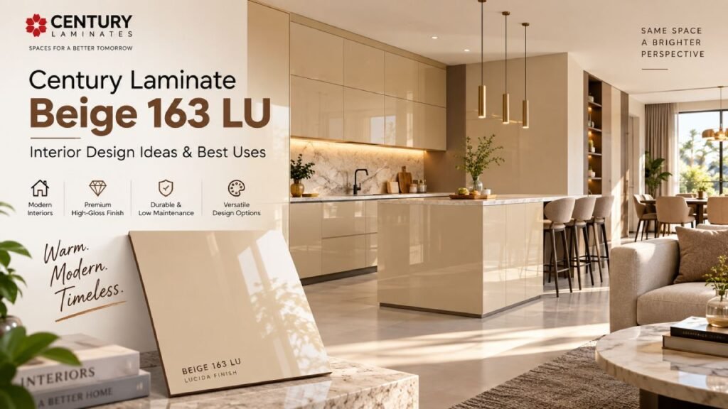
Beige has a reputation problem. Say the word out loud and most people picture something safe to the point of forgettable — a colour chosen because nobody could object to it, not because anyone actually loved it. Century Laminate Beige 163 LU exists to fix that reputation. This is a beige with a high-gloss finish that catches light instead of absorbing it, warm enough to feel inviting, polished enough to feel deliberate. It’s the kind of neutral that still does something in a room. That’s the whole appeal of Century Laminate Beige 163 LU: it gives you the calm, adaptable base that beige has always been known for, minus the flatness. At Sarab Architects & Consultants, we’ve been specifying it more often lately for clients who want warmth without colour, and texture without pattern — a laminate that quietly upgrades a room rather than announcing itself. In this guide, we’ll cover what Century Laminate Beige 163 LU actually is, its specifications and finish, the benefits it brings, six of the best places to use it, and how to pair it so the result feels rich rather than plain. What Is Century Laminate Beige 163 LU? 163 is the design code, and LU points to Century’s Lucida finish — the same high-gloss system behind several of the brand’s most-requested solid laminates. Century Laminate Beige 163 LU sits within the Lucida Solids range, a collection built around clean, single-tone colours with a reflective, polished surface rather than texture or pattern.The beige itself leans warm — closer to sand or wheat than to the greyish, “greige” tones that have dominated neutral palettes recently. Combined with the Lucida gloss, it reads as considerably more premium than a matte beige laminate of the same shade, since the shine adds a sense of depth and light that a flat finish simply can’t replicate. Specifications of Century Laminate Beige 163 LU Stripped down to the essentials, Century Laminate Beige 163 LU typically comes as: standard 8×4 ft (2440mm × 1220mm) sheets, 1mm thickness for furniture-grade laminate work, a high-gloss Lucida finish, and Century’s standard suite of performance properties — scuff, mar, abrasion, stain, and impact resistance, along with heat resistance and colour fastness. It’s also worth noting that Century sells this same design code, 163, across multiple finishes — including a suede (SU), textured (UL), and matte (SF) version — so it’s worth double-checking that “LU” specifically is what’s being quoted or delivered, since the finish changes the look considerably. Why Century Laminate Beige 163 LU Deserves a Second Look Warm neutrals are trending hard in interior design right now, and Century Laminate Beige 163 LU sits comfortably at the centre of that shift, for a few solid reasons: Beige is being reclaimed. After years of stark white and cool grey dominating modern interiors, warmer neutrals are making a comeback — and a beige with genuine depth, rather than a flat builder-grade tone, fits that mood perfectly. Gloss changes the conversation. A matte beige can feel a little dated or plain. Run the same tone through a high-gloss finish, and it suddenly reads as current and considered. It’s endlessly easy to work with. Because it’s a true neutral, Century Laminate Beige 163 LU pairs with almost anything — wood, black, brass, marble — without any risk of clashing. It photographs warmer than white. In photos and in person, this shade brings a coziness that starker whites and greys can’t quite manage, which is part of why it’s become popular for spaces meant to feel welcoming rather than clinical. Benefits of Century Laminate Beige 163 LU The appeal isn’t just visual — this laminate is built to actually earn its keep on daily-use furniture. ✅ Scuff and mar resistant — the Lucida finish holds up to the everyday contact that dulls a glossy surface over time. ✅ Stain and abrasion resistant — genuinely useful on kitchen counters, islands, and wardrobe fronts that see constant use. ✅ Impact resistant — shrugs off knocks and bumps far better than a painted glossy surface, which chips easily. ✅ Heat resistant — safe for use in kitchens, even near warmer cooking zones. ✅ Colour fastness — stays warm and consistent rather than yellowing or fading, which matters for a shade this specific. ✅ Low maintenance — a simple wipe-down keeps the shine looking fresh, with none of the touch-up cycle painted surfaces required. Put together, these properties mean you’re not trading durability for warmth here — Century Laminate Beige 163 LU delivers both, which is exactly why it’s held up as a genuine long-term specification rather than a passing colour trend. 6 Best Uses for Century Laminate Beige 163 LU Because it’s such a versatile neutral, this laminate earns its place across more of a home or commercial space than you might expect. 1. Beige 163 LU Modular Kitchens On kitchen cabinetry, Century Laminate Beige 163 LU offers a warmer alternative to an all-white kitchen without tipping into a heavy, dark palette. Paired with brushed brass or matte black handles, it strikes a genuinely elegant balance. 2. Wardrobes and Bedroom Storage A wardrobe finished in this beige brings a soft, hotel-suite warmth to a bedroom. It’s calm enough to support restful sleep while still feeling considerably more polished than a plain white or grey shutter. 3. Living Room Feature Walls and TV Units Behind a television or across an accent wall, the gloss finish on Century Laminate Beige 163 LU catches ambient and accent lighting in a way flat paint can’t, giving the living room a soft, warm glow in the evening. 4. Study Units and Home Offices For a study desk or home office storage unit, this beige creates a calm, focused environment — warm enough to feel comfortable, polished enough to still feel professional. 5. Boutique Retail and Hospitality Interiors In boutique stores, cafes, and hospitality interiors, Century Laminate Beige 163 LU communicates warmth and approachability, which matters enormously in spaces designed to make customers feel welcome and unhurried.
Snow Glacier 3917 LU Laminate: Interior Design Ideas & Best Uses
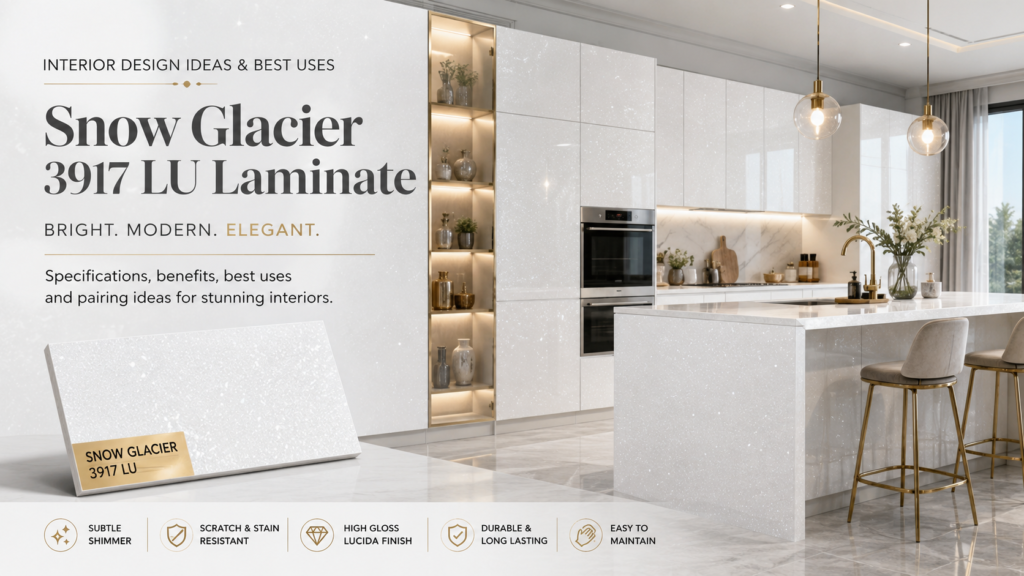
Some laminates try to be loud. Snow Glacier 3917 LU takes the opposite approach — and somehow ends up just as memorable. It’s an icy white shimmer of a finish, catching light in tiny flecks rather than one solid gloss, the way sunlight glints off actual snow. Stand in front of a wardrobe or kitchen panel finished in this laminate, and you’ll find yourself tilting your head slightly, just to watch the surface change. That subtlety is exactly the point. Snow Glacier 3917 LU belongs to Century Laminate’s Lucida “Glitters” collection — a range built around exactly this kind of understated sparkle. It’s not a colour so much as an effect: bright, cool, and faintly luminous, somewhere between fresh snowfall and polished frost. At Sarab Architects & Consultants, we’ve started reaching for it whenever a client wants a white that still has something going on beneath the surface. In this guide, we’ll walk through what Snow Glacier 3917 LU actually is, its specifications and finish, the benefits it brings to a space, where it works best, and how to pair it so the shimmer reads as elegant rather than gaudy. What Is Snow Glacier 3917 LU Laminate? White laminates are everywhere, so what makes this one worth a second look? A few reasons Snow Glacier 3917 LU keeps showing up in current design conversations: It solves the “boring white” problem. A lot of clients want a bright, clean palette but worry it’ll feel flat or clinical. The shimmer in Snow Glacier 3917 LU adds visual interest without introducing colour, which keeps the palette light while still giving the eye something to notice. It plays beautifully with light. Near a window, under pendant lighting, beside an LED strip — the surface behaves differently depending on the light source, which gives a room a subtle sense of movement most flat finishes can’t offer. It bridges styles. Because it’s essentially a refined white, Snow Glacier 3917 LU sits comfortably in minimalist interiors, glam-leaning spaces, and even more traditional homes without feeling out of place in any of them. It photographs like a premium material. The shimmer catches a camera flash or natural light in a way that reads as expensive, even though it’s priced in line with other standard laminates in the range. Benefits of Snow Glacier 3917 LU Laminate Beyond the visual appeal, there’s a genuinely practical case for specifying Snow Glacier 3917 LU on real, daily-use furniture: Scuff and mar resistant — the Lucida finish is built to resist the everyday marks that dull a glossy surface over time. Stain and abrasion resistant — a real advantage on kitchen counters, islands, and wardrobe fronts that see constant contact. Impact resistant — holds up to knocks far better than a painted glossy finish, which chips easily. Heat resistant — safe to use near warmer kitchen zones without discolouring. Colour fastness — the shimmer and brightness stay consistent over time rather than dulling or yellowing, which matters enormously for a light, reflective finish. Low maintenance — a soft, damp cloth is usually all it takes to keep the shimmer looking fresh. Put together, these properties mean Snow Glacier 3917 LU doesn’t ask you to sacrifice durability for that extra visual sparkle — it delivers both, which is exactly why it holds up as a long-term specification choice rather than a passing decorative trend. Snow Glacier 3917 LU vs Plain White Laminate It’s a fair question: if you already like white, why not just go with a standard plain white laminate? The shimmer is the whole answer, but here’s how the two actually compare side by side. Feature Snow Glacier 3917 LU Plain White Laminate Appearance Subtle shimmer Flat/solid Light reflection High Low–high depending on finish Visual interest Higher Minimal Best for Premium contemporary interiors Clean minimalist interiors Maintenance Easy Neither option is “better” outright — it comes down to the mood you’re after. A plain white laminate is the right call when you want a completely quiet, minimalist backdrop that recedes into the room. Snow Glacier 3917 LU is the better pick when you still want that brightness, but with a little more texture and visual depth built into the surface itself. Where to Use Snow Glacier 3917 LU This laminate is versatile enough to anchor a wide range of spaces, provided it’s placed with a little intention. 1. Modular Kitchens On kitchen cabinetry, Snow Glacier 3917 LU brightens the space without falling into the flatness of a plain white kitchen. It pairs particularly well with warm task lighting, which brings out the shimmer and keeps the kitchen feeling lively rather than sterile. 2. Wardrobes and Bedroom Storage A wardrobe finished in Snow Glacier 3917 LU brings a soft glow to a bedroom, especially when it catches early morning or evening light. It’s bright enough to open up a smaller room, while the shimmer keeps it from reading as plain or builder-grade. 3. Living Room Feature Walls and TV Units Behind a TV or across an accent wall, the subtle sparkle of Snow Glacier 3917 LU creates a soft focal point without the drama of a bold colour — ideal for homeowners who want visual interest but still lean toward a light, neutral palette. 4. Bathroom Vanities In reception areas, retail counters, and boutique interiors, Snow Glacier 3917 LU communicates polish and attention to detail — a premium finish without the cost or upkeep of natural stone. 5. Office and Commercial Interiors In reception areas, retail counters, and boutique interiors, Snow Glacier 3917 LU communicates polish and attention to detail — a premium finish without the cost or upkeep of natural stone 6. Ceiling Panels and Overhead Accents Because it’s so responsive to light, Snow Glacier 3917 LU also works well on ceiling panelling or coves, where indirect lighting can bounce off the shimmer and soften an entire room’s ambience after dark. How to Pair Snow Glacier 3917 LU Since it’s fundamentally a white with texture rather than a
Main Hall Modern TV Unit Design: 10 Ideas to Try
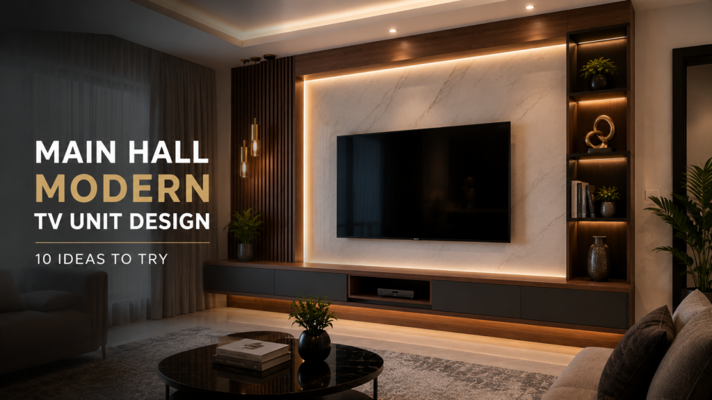
Every main hall has one wall that quietly decides how the whole room feels. Nine times out of ten, that’s the wall behind the television. Get it right, and the entire space feels pulled together the moment you walk in. Get it wrong — mismatched finishes, visible cables, an oversized cabinet, or colours fighting with the sofa — and even a beautifully furnished room can feel unfinished. That’s why the main hall modern TV unit design has become such an important part of contemporary Indian interiors. A TV unit is no longer simply a place to keep the television. A well-planned design can hide wires, provide storage, introduce texture, create ambient lighting, and establish a visual focal point for the entire living room. Whether you call it the main hall, living room, drawing room, or family room, the principle is the same: the TV wall should feel like part of the architecture, not an afterthought. At Sarab Architects & Consultants, TV wall and main hall designs are among the most common requirements from homeowners planning a new interior or renovating an existing space. Here are 10 modern TV unit ideas worth considering, along with practical tips to help you choose the right one for your home. Main Hall Modern TV Unit Design at a Glance TV Unit Design Best For Main Benefit Floating TV Unit Small main halls Creates a lighter, more open look Full-Height TV Wall Large walls Creates a premium focal point Open Shelving Display-focused interiors Adds personality and storage Backlit TV Unit Modern interiors Adds ambient lighting Two-Tone Unit Contemporary homes Creates colour and depth Wood & Stone Combination Premium interiors Adds warmth and texture Slatted Wood Panels Modern homes Adds height and visual rhythm Compact TV Unit Small apartments Saves valuable space Hidden Storage Unit Family homes Keeps clutter concealed Statement Laminate Unit Bold interiors Creates a strong focal point 1. Floating Wall-Mounted TV Units There’s something almost magical about a TV unit that appears to hover, with no visible legs touching the floor. A floating TV unit instantly makes a main hall feel more spacious because the open floor underneath creates a lighter visual appearance. This makes it particularly useful in apartments and smaller living rooms where every square foot matters. The design can be kept simple with a wall-mounted cabinet beneath the television, or expanded into a larger composition with vertical panels, open shelves, and concealed LED lighting. Why Choose a Floating TV Unit? Makes the floor appear more open Creates a clean, contemporary appearance Makes cleaning underneath easier Works particularly well in smaller apartments Allows concealed cable management Can be combined with LED strip lighting A floating unit doesn’t need to be complicated. Sometimes a simple wood-look or neutral laminate cabinet paired with a textured backdrop is enough to make the TV wall feel thoughtfully designed. 2. Full-Height Wall Panelling with an Integrated TV Instead of treating the television as a separate object sitting on a cabinet, consider making the entire wall part of the TV-unit design. A floor-to-ceiling panelled wall can incorporate the television, storage, lighting, shelving, and decorative elements into one cohesive composition. Depending on your interior style and budget, the background can use: Wood-look panels PVC wall panels Decorative laminate Fluted or slatted panels Stone or marble-look surfaces Textured wall finishes The television then becomes part of the wall rather than appearing as a separate black rectangle mounted onto it. Best For This approach works particularly well when the main hall has a large uninterrupted wall that needs a strong architectural feature. For smaller rooms, however, a full-height dark wall can sometimes feel visually heavy. In such cases, lighter finishes or partial panelling may work better. 3. Open Shelving with Asymmetric Layouts Symmetry is safe. Asymmetry is interesting. An open-shelf TV unit can introduce personality without making the wall feel overly formal. Instead of creating identical shelves on both sides of the television, designers can use different shelf widths, heights, depths, and spacing. The result is a more relaxed composition that gives homeowners space to display: Books Plants Decorative objects Artwork Family photographs Lamps Collectibles Keep Open Shelving Visually Balanced The trick is not to fill every shelf. Leaving some shelves intentionally empty creates breathing room and prevents the TV wall from becoming visually cluttered. A combination of books, greenery, ceramics, and a few personal objects usually works better than displaying everything at once. 4. Backlit TV Units with LED Ambient Lighting Lighting can completely change how a TV wall looks after sunset. Adding a concealed LED strip behind the television, underneath a floating cabinet, or around the edges of a feature panel creates a soft layer of ambient illumination. Rather than relying only on the main ceiling lights, the TV wall becomes part of the evening lighting scheme. Why Backlighting Works A softly illuminated background can make the television wall feel deeper and more sophisticated. It can also reduce the harsh visual contrast between a bright screen and a completely dark surrounding wall. Warm white lighting is generally a versatile choice for residential interiors because it creates a relaxed evening atmosphere without making the space feel overly theatrical. For an even more refined result, conceal the LED source so that you see the glow rather than the light strip itself. 5. Two-Tone Colour Block TV Units for Living Room Using two contrasting finishes on the same TV unit is one of the easiest ways to introduce depth without relying on complicated textures. For example, you could combine: Dark grey + warm wood White + walnut Beige + charcoal Green + natural wood Deep purple + soft white Black + marble-look finish The darker finish can anchor the lower cabinet while a lighter material frames the television, or the colour can be introduced as a smaller accent within an otherwise neutral design. Why Two-Tone Designs Work A two-tone TV unit allows you to introduce
Darkish Purple 265 LU Laminate: Design Ideas & Uses
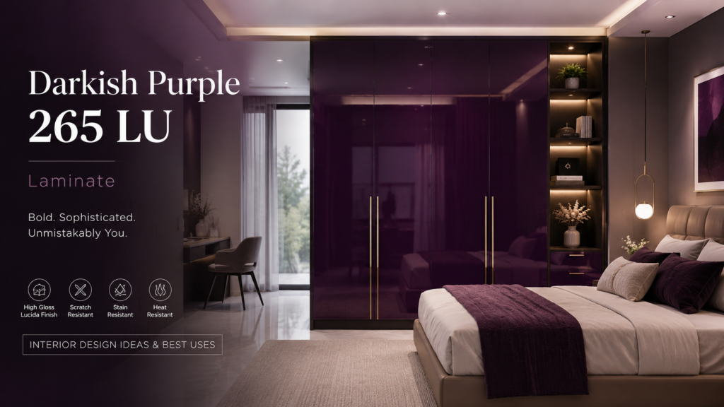
Walk into a room finished with Darkish Purple 265 LU and you’ll notice it before you notice anything else. Not loud, exactly — more like a whisper that somehow fills the whole room. This is a laminate that refuses to disappear into the background the way most neutral shades are designed to. It’s deep. It’s glossy. It catches every stray beam of light and throws it back at you, richer than it arrived. Most homeowners chase safety — the beige sofa, the white cabinet, the wall colour nobody will ever notice. Darkish Purple 265 LU is for the ones who’ve had enough safety. At Sarab Architects & Consultants, we’ve watched more clients trade their all-neutral instincts for something with actual personality, and this shade sits right at the front of that shift. So — what exactly makes it tick, where should it go, and how do you use it without your bedroom looking like a nightclub? Let’s get into it. What Is Darkish Purple 265 LU Laminate? 265 is the design code. LU stands for Lucida — Century Laminate’s signature high-gloss finish, built to shine rather than sit flat. Together, they make Darkish Purple 265 LU: a deep, moody shade hovering somewhere between classic purple and dark violet, dialled down just enough to skip “playful” and land squarely on “sophisticated.” Here’s the thing about gloss: it changes everything. A matte purple this dark would feel heavy, almost bruised. But run that same colour through the Lucida finish, and suddenly it has movement — shifting slightly as the light in the room shifts, never looking quite the same twice. That’s the whole trick behind Darkish Purple 265 LU, and it’s why designers keep reaching for it instead of a flatter alternative. Specifications of Darkish Purple 265 LU Laminate Strip away the mood and drama, and the specs are refreshingly practical. Darkish Purple 265 LU ships in standard 8×4 ft sheets, most commonly at 1mm thickness for furniture-grade work (heavier compact variants exist for structural use), finished in Century’s high-gloss Lucida coating, and built with scuff, mar, abrasion, stain, impact, and heat resistance baked in as standard. Translation: it looks dramatic, but it’s built like a workhorse. Why Darkish Purple 265 LU Is Having a Moment Bold laminate colours are having a real comeback, and Darkish Purple 265 LU is leading the charge for a few good reasons. Neutral fatigue is real. After a decade of white-on-white-on-beige, people are craving colour that actually does something. Purple carries baggage — the good kind. Designers and colour psychologists have tied purple to luxury, creativity, and depth for decades. Put it on a wardrobe, and the room inherits that reputation instantly. Gloss photographs like nothing else. A flat wall can’t compete with a surface that throws light around a room. That’s a big part of why bold, glossy laminates are all over design feeds lately. It never looks accidental. Nobody stumbles into Darkish Purple 265 LU by mistake. The moment it’s in a room, it announces that someone made a decision. Benefits of Darkish Purple 265 LU Laminate Drama is one thing. Durability is another — and this laminate doesn’t skimp on either. ✅Scuff and mar resistant — the Lucida finish is engineered specifically to survive daily contact without dulling. ✅Stain and abrasion resistant — genuinely useful on anything that gets touched often, like a wardrobe door or kitchen island edge. ✅ Impact resistant — shrugs off the knocks that would chip a painted glossy surface within a year. ✅Heat resistant — holds its ground even near warmer kitchen zones. ✅Colour fastness — stays rich and saturated instead of fading, which matters enormously for a dark shade where fading would be painfully obvious. ✅ Wipe-clean maintenance — no repainting cycle, no touch-ups, no fuss. In short: Darkish Purple 265 LU doesn’t ask you to choose between bold and practical. It’s both, which is exactly why it holds up as a genuine design choice rather than a phase you’ll regret in two years. 6 Best Uses for Darkish Purple 265 LU Laminate Used with intention, this shade of purple earns its place in more rooms than you’d expect. Here are six where it truly delivers. 1. Bedroom Wardrobes This is where Darkish Purple 265 LU does its best work. A full wardrobe wall in this colour instantly becomes the room’s anchor — the thing your eye returns to, without ever feeling like it’s shouting. Pair it with soft white or warm-toned walls, and the room stays grounded even while the wardrobe carries all the drama. 2. Kitchen Islands and Base Cabinets Drop it onto a kitchen island or the lower run of cabinets, and suddenly the kitchen has a focal point that doesn’t need a single accessory. Keep the upper cabinets light and neutral, and the whole space stays open instead of closing in on itself. 3. Living Room Feature Walls and TV Units Behind a TV or across a feature wall, the Lucida gloss finish earns its keep — bouncing ambient and accent lighting around the room in a way flat paint simply can’t touch. 4. Study or Home Office Furniture There’s a reason purple has long been tied to creativity and focus. A study unit finished in Darkish Purple 265 LU brings both — reading as sharp and professional rather than whimsical. 5. Boutique Retail and Salon Interiors In a boutique, salon, or lounge, this colour does branding work no signage can match. It tells customers, instantly, that the space was designed to feel indulgent — not default. 6. Accent Furniture and Display Units Not ready to commit to a full wardrobe? A single bar unit, display cabinet, or shelving piece in Darkish Purple 265 LU still delivers the personality, minus the full commitment. How to Pair Darkish Purple 265 LU This is a colour with strong opinions, so pairing matters more than usual. Soft white or off-white surfaces — keep the depth of the purple
108 Absolute White Greenlam Laminate: Uses, Pairing Ideas & Where to Use It
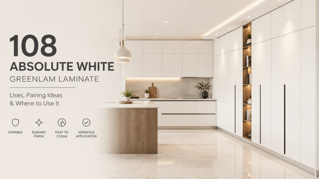
Every interior designer eventually reaches for the same shade at some point in a project: a clean, uncompromising white that doesn’t lean warm or cool, doesn’t yellow with age, and works as a quiet backdrop for everything else in the room. In the Greenlam catalogue, that shade has a name and a number — 108 Absolute White Greenlam Laminate — and it’s become one of the brand’s most consistently specified laminates across Indian homes and commercial spaces alike. Unlike a trend colour that designers rotate in and out of a project, Absolute White is closer to a design essential — the laminate equivalent of a well-cut white shirt. It’s rarely the star of a room, but it’s often the reason everything else in that room looks considered rather than cluttered. In this guide, we’ll walk through exactly what 108 Absolute White is, its specifications and finishes, where it performs best, and how to pair it so a space feels deliberate rather than default. What Is 108 Absolute White Greenlam Laminate? 108 is Greenlam’s design code for its Absolute White laminate — a plain, high-pressure laminate (HPL) sheet manufactured for cabinetry, wardrobes, wall panelling, and commercial interiors. It’s part of Greenlam’s core plain-colour collection, sold in the standard 8×4 ft sheet size, and available across multiple thicknesses to suit different applications: 0.8mm — Lightweight and flexible, suited to cabinetry, decorative panels, and lighter-use furniture. 1.0mm — The most commonly specified thickness, balancing durability and flexibility for most residential interiors. 1.25mm — A heavier-duty option for high-traffic commercial spaces or surfaces that need extra impact resistance. Specifications of 108 Absolute White Greenlam Laminate At a glance, 108 Absolute White Greenlam Laminate is typically supplied as: 8×4 ft sheets, 0.8mm/1.0mm/1.25mm thickness options, Suede (SUD) as the primary finish (with SF/gloss also available), and a plain, true-neutral white colourway with no undertone. These specs are what make it such a dependable, easy-to-source choice across both residential and commercial projects. Key Features and Benefits What keeps 108 Absolute White in near-constant demand isn’t just the colour — it’s the performance that comes with Greenlam’s manufacturing standard. Laminates in this range are typically: ✅ Abrasion and impact resistant, holding up well to daily contact on cabinets, wardrobes, and worktops. ✅ Anti-fungal and antibacterial, which matters in humid Indian climates and in kitchens or bathrooms where hygiene is a priority. ✅ Resistant to colour fading, tested against prolonged light exposure so the white stays true rather than yellowing the way some cheaper laminates or painted surfaces do over time. ✅ Heat and scratch resistant, making it a practical choice for kitchen cabinetry near cooking zones. ✅ Dimensionally stable at elevated temperatures, meaning it won’t warp or bubble in hot, humid conditions the way lower-grade sheets can. ✅ Low maintenance, needing nothing more than a wipe-down with a damp cloth to stay looking new. Put together, these properties are exactly why Absolute White shows up so often in kitchens and high-use furniture rather than just decorative accents — it’s built to actually survive the room it’s used in, not just look good in a sample swatch. Where to Use 108 Absolute White Greenlam Laminate A laminate this versatile can go almost anywhere, but it performs particularly well in a few specific applications. 1. Modular Kitchens Absolute White is one of the most common choices for kitchen cabinetry — both overhead and base units — because it reflects light well in what’s often a compact, heavily used space, and it pairs cleanly with almost any countertop material. A full white kitchen in 108 Absolute White, finished with brushed steel or matte black handles, reads as bright and contemporary without feeling clinical. 2. Wardrobes and Bedroom Storage On wardrobe shutters, the Suede finish of 108 Absolute White gives bedrooms a soft, understated storage wall that doesn’t compete with other design elements in the room — headboards, bedding, or an accent wall can carry the colour and personality instead. 3. Office and Commercial Interiors In offices, clinics, and retail interiors, Absolute White is frequently used on reception counters, workstation panels, and storage units, where a clean, neutral surface supports branding, signage, and other design elements without visual competition. 4. Wall Panelling and False Ceiling Trims Because it’s lightweight and available in multiple thicknesses, 108 Absolute White also works well as a plain panelling material — either as a full accent or as trim detailing alongside a bolder colour or textured panel. 5. Study Units and Utility Furniture For utility furniture — shoe racks, crockery units, storage lofts — Absolute White is a practical, budget-conscious choice that still looks deliberate rather than purely functional. Pairing Ideas for 108 Absolute White Greenlam Laminate A plain white laminate is only as good as what’s placed around it, and Absolute White is genuinely one of the easier shades to design with. A few pairings that consistently work well: With warm wood tones — A classic combination for kitchens and wardrobes; the warmth of wood keeps an all-white scheme from feeling sterile. With matte black hardware — Black handles, taps, or trim against Absolute White create a crisp, high-contrast look that reads as modern without much extra effort. With brass or gold accents — Adds a touch of warmth and richness, especially effective in kitchens and bathroom vanities. With soft pastels — Since Absolute White is neutral rather than stark or blue-toned, it sits comfortably alongside sage green, dusty blue, or blush accent walls without clashing. With natural stone or marble-look countertops — A near-universal pairing that keeps kitchens and bathrooms feeling bright, clean, and cohesive. What to avoid — Pairing Absolute White with a slightly warmer “off-white” or ivory laminate in the same unit can look like a mismatch rather than an intentional two-tone scheme; keep whites consistent within a single piece of furniture. How 108 Absolute White Greenlam Laminate Compares to Other Whites Not all “white” laminates are the same shade, and the difference matters more
21099 Merino Royal Grey Laminate: Specifications, Finish & Best Uses
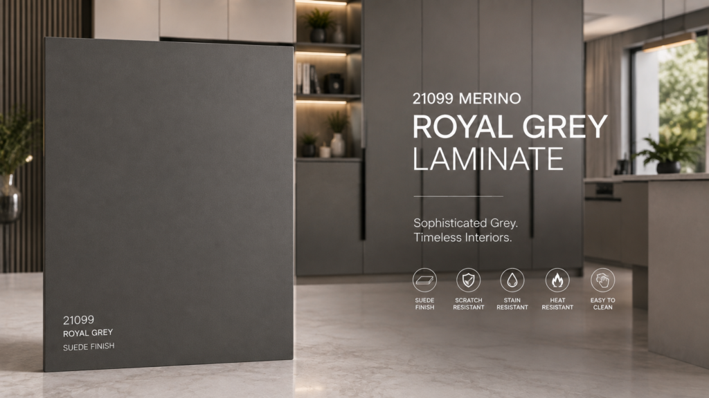
Grey has quietly become one of the most requested laminate families in Indian interiors, and for good reason — it sits comfortably between the starkness of white and the heaviness of black, giving a space a grounded, contemporary feel without demanding much else around it. In Merino’s laminate catalogue, one specific shade in that grey family has become a consistent favourite across kitchens, wardrobes, and commercial interiors: 21099 Merino Royal Grey Laminate. Design code 21099 belongs to Merino’s Monochrome collection — a curated range of plain greys, whites, and neutrals built for exactly this kind of dependable, everyday specification work. Royal Grey sits toward the deeper, richer end of that grey spectrum, which is part of why it reads as more “designed” than some of the flatter, cooler greys nearby in the same range. In this guide, we’ll cover what 21099 Merino Royal Grey Laminate actually is, its specifications and finish, where it performs best, and how to pair it so a space feels considered rather than just neutral. What Is 21099 Merino Royal Grey Laminate? 21099 is Merino’s design code for Royal Grey — a plain, high-pressure laminate (HPL) manufactured from decorative papers and absorbent kraft layers, bonded under heat and pressure into a durable, single-colour sheet. It’s part of the brand’s Monochrome range, sitting alongside other named greys like Ash Grey (21089), Pebble Grey (21369), Silver Grey (21069), and Warm Grey (21029) — which is worth knowing, since these shades are often confused with one another when sourcing from a swatch book rather than a physical sample. 21099 Merino Royal Grey Laminate is most commonly supplied in a Suede (SUD) finish — a soft, matte surface with a gentle, low-glare texture — and is available in standard sheet sizes of roughly 1220 × 2440mm (about 4×8 ft) and 1220 × 3050mm (about 4×10 ft), giving some flexibility depending on the size of the surface being covered. Specifications of 21099 Merino Royal Grey Laminate At a glance, 21099 Merino Royal Grey Laminate is typically available as: a plain, true-grey colourway with no strong blue or brown undertone; a Suede (SUD) finish as the primary option; standard sheet sizes of 1220×2440mm and 1220×3050mm; and pricing that generally sits in the accessible, everyday range for plain laminates (commonly around ₹1,300 per sheet, though this varies by dealer and city). These specs are exactly why it’s become such a dependable, easy-to-source choice for designers working across both residential and commercial projects. Key Features and Benefits Beyond the colour itself, 21099 Merino Royal Grey Laminate carries the performance characteristics that have made Merino a trusted laminate brand across India: ✅ Scratch resistant — holds up well against daily contact on cabinets, countertops, and wardrobe shutters. ✅Stain resistant — a practical advantage in kitchens and high-touch furniture, where spills and marks are a daily reality. ✅ Impact resistant — manufactured to withstand knocks and bumps without chipping the way painted surfaces can. ✅Heat resistant — suitable for use near cooking zones and other warm environments without discolouring or warping. ✅ Low maintenance — a simple wipe with a damp cloth (and a little dish soap for stronger marks) is generally enough to keep the surface looking new. ✅Consistent factory finish — because it’s manufactured under controlled conditions, the shade and texture you see on a sample is what arrives on your sheet, with only minor variation between batches. Together, these properties are why Royal Grey shows up as often in functional, high-use furniture as it does in purely decorative accents — it’s built to actually perform, not just look good on a swatch. Where to Use 21099 Merino Royal Grey Laminate Grey is a genuinely versatile base, and 21099 Merino Royal Grey Laminate adapts well across several parts of a home or commercial space. 1. Modular Kitchens On kitchen cabinetry — both base and overhead units — Royal Grey offers a more grounded, sophisticated alternative to an all-white kitchen, without tipping into the heaviness of a very dark colour. Paired with a light or white countertop, it keeps the kitchen bright while still feeling deliberately styled. 2. Wardrobes and Bedroom Storage On wardrobe shutters, the Suede finish of 21099 Merino Royal Grey Laminate brings a calm, hotel-like quality to a bedroom. It’s dark enough to add depth and personality, but neutral enough that it won’t clash with bedding, curtains, or an accent wall in a different tone. 3. Wall Panels and Feature Walls Because it’s supplied in generous sheet sizes, Royal Grey works well as a panelling material for accent walls — particularly behind a bed or in a living room, where a matte grey surface can anchor a space without competing with artwork or furniture. 4. Office and Commercial Interiors In office interiors, reception areas, and retail fit-outs, Royal Grey is a practical choice for workstation panels, counters, and storage units, where a neutral, professional tone is more important than a bold design statement. 5. Study Units and Utility Furniture For shelving, study desks, and utility cabinetry, Royal Grey offers a step up from plain white without adding cost or maintenance — a small design upgrade that still reads as intentional. Pairing Ideas for 21099 Merino Royal Grey Laminate Grey is one of the more forgiving colours to design around, but a few pairings work especially well with this particular shade: With warm wood tones — Balances the coolness of grey with natural warmth, a strong combination for kitchens, wardrobes, and living spaces. With matte black hardware — Creates a refined, tonal look, since black and Royal Grey sit close enough in tone to feel coordinated rather than contrasted. With brass or gold accents — Adds warmth and a touch of richness, especially effective on kitchen handles or wardrobe hardware. With white or off-white walls — Lets Royal Grey act as the room’s anchor colour without competing with a busier wall shade. What to avoid — Pairing Royal Grey with a much cooler, blue-toned
Modern PVC Wall Panel Design for Bedroom: The Complete Guide
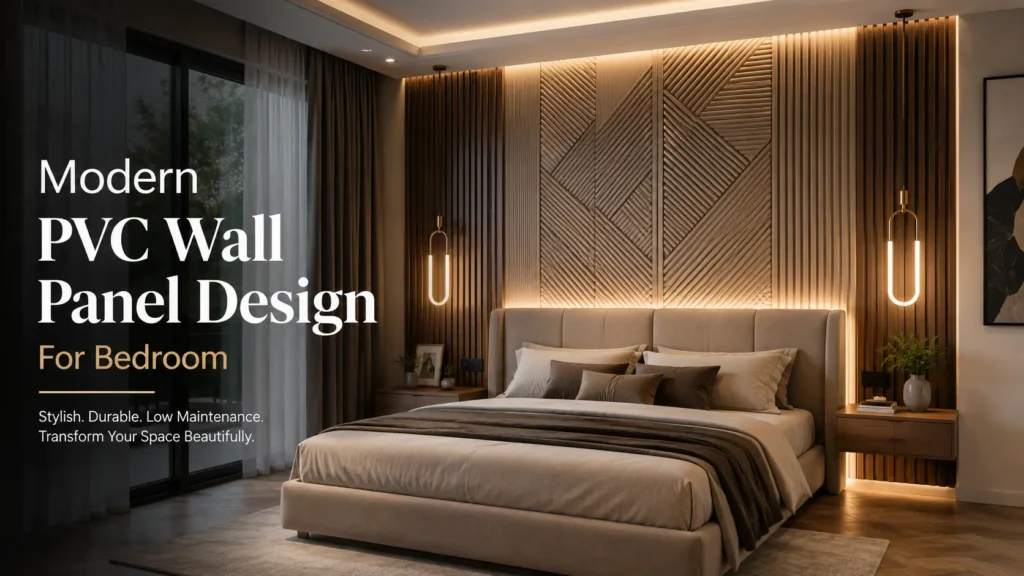
There’s a particular kind of bedroom wall that stops you at the doorway — not because of a loud colour or an expensive headboard, but because of texture. A subtle 3D ripple catching the evening light. A herringbone pattern running quietly behind the bed. A matte charcoal panel that makes the whole room feel deeper and calmer than four flat, painted walls ever could.Increasingly, that texture is coming from PVC wall panels — and it’s easy to see why designers keep reaching for them. They deliver the visual richness of wood, stone, or fabric cladding, at a fraction of the cost, weight, and installation time, without any of the moisture worries that come with natural materials in Indian bedrooms.At Sarab Architects & Consultants, PVC wall panelling has become one of our most requested bedroom features — not just for feature walls, but for wardrobes, ceilings, and even full-room cladding in contemporary homes. In this guide, we’ll walk through what a modern PVC wall panel design for bedroom spaces actually involves, why it’s become a design favourite, the benefits that make it worth considering, the styles trending right now, and how to plan one for your own room. What Are PVC Wall Panels? PVC (polyvinyl chloride) wall panels are lightweight, factory-manufactured boards used to clad walls and ceilings. Unlike solid wood or stone, they’re hollow-core or foam-core sheets finished with a printed, embossed, or laminated surface that can convincingly mimic wood grain, fabric weave, stone texture, or entirely abstract 3D patterns. What sets modern PVC panels apart from the plain plastic sheeting once associated with bathrooms and utility spaces is the sheer range of finishes now available — brushed matte, high-gloss, textured 3D relief, wood-look grain, and even panels with integrated LED backlighting channels. Panels typically click, slot, or adhere directly onto a wall, which makes installation dramatically faster and less disruptive than plastering, painting, or wallpapering an entire bedroom. Why PVC Wall Panels Are a Leading 2026-27 Bedroom Trend Wall panelling as a category has been on the rise across Indian interiors for a few years now, and a modern PVC wall panel design for bedroom spaces has emerged as one of the styles homeowners keep circling back to. A few reasons this trend has real staying power: Texture is replacing colour as the primary design tool. Designers are increasingly using dimension and pattern — not just paint colour — to make a room feel intentional. A textured panel does more visual work than a flat coloured wall ever could. Bedrooms are becoming retreat spaces. As homes double as offices, gyms, and everything else, the bedroom has become the one room people want to feel deliberately calm and enclosed. Panelling — especially soft, matte, or wood-toned styles — supports that hotel-suite feeling. Renovation timelines are getting shorter. Panels install in a fraction of the time a plastered and painted feature wall would take, with far less mess — a major factor for homeowners renovating an occupied home. Social media has normalised statement walls. A backlit 3D panel wall behind a bed photographs beautifully, and that visibility has pushed the style from niche to mainstream very quickly. Benefits of PVC Wall Panels for Bedrooms Beyond the styling appeal, PVC wall panels solve a handful of very real, practical problems that Indian homeowners run into with bedroom walls — which is a big part of why they’ve moved from a “nice-to-have” to a genuine design default. ✔ Genuinely low maintenance. Panels don’t need repainting, and most finishes wipe clean with a dry or lightly damp cloth. There’s no annual touch-up cycle the way there is with painted walls. ✔ ️ Moisture and humidity resistant. Bedrooms with attached bathrooms or dressing areas often deal with humidity creeping into nearby walls. PVC doesn’t absorb moisture the way plaster or wallpaper can, which also means it resists mold and mildew far better over time. ✔ ️ Lightweight, without the structural fuss. Because panels are hollow or foam-core, they add almost no load to a wall, which makes them safe to use even on partition walls or in older buildings where you wouldn’t want to hang heavy stone or wood cladding. ✔ Scratch and dent resistant. High-traffic surfaces — around a bed frame, behind a dressing table, along a walkway — hold up to daily contact far better than painted plaster, which chips and marks more easily. ✔ Fast, low-disruption installation. Panels typically click, slot, or adhere into place, which means a full feature wall can often be completed in a day or two, with none of the drying time, dust, or fumes of plastering and painting. ✔ Budget flexibility. PVC panelling is available at a wide range of price points, so a single accent wall can be done affordably, while premium 3D or backlit panels can anchor a full luxury master bedroom without the cost of real wood or stone cladding. ✔ Consistent, predictable finish. Because panels are factory-produced, the pattern, colour, and texture you see in a sample is exactly what arrives on your wall — no variation from batch to batch the way paint or natural wood can have. Taken together, these benefits are why PVC has moved well beyond its old reputation as a purely utilitarian, bathroom-and-kitchen material — in a bedroom, it now competes directly with far more expensive cladding options, without most of their drawbacks. Modern PVC Wall Panel Design Ideas for Bedrooms This is where PVC really earns its popularity — the sheer range of looks achievable with one material. Here are the styles currently leading bedroom design. 1. 3D Textured Panels for Bedrooms Raised wave, cube, or ripple textures turn a flat wall into a sculptural surface. Positioned as a headboard wall and lit with a warm directional wall light or LED strip, the shadows created by the texture shift throughout the day, giving the room a sense of depth that flat paint simply can’t replicate. This style works especially well in
Aqua Green Laminate: Interior Design Ideas for Modern Homes
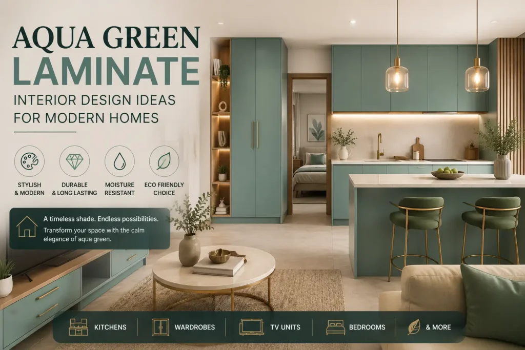
There’s a particular shade of green making its way into homes across India right now — not the loud, tropical green of decades past, but something quieter. Somewhere between sea glass and sage, cool enough to feel fresh, warm enough to feel inviting. Designers have started calling it the “new neutral,” and once you notice it, you’ll spot it everywhere: on a kitchen island in a Bangalore apartment, a wardrobe shutter in a Delhi bedroom, a feature wall behind a Mumbai television unit. That colour is aqua green laminate, and it might just be the easiest way to make a home feel instantly more considered. Unlike paint, which needs constant touch-ups and shows every scuff within a year, laminate brings colour, durability, and a designer-grade finish in one sheet. At Sarab Architects & Consultants, we’ve been specifying it across kitchens, wardrobes, and accent walls for clients who want their homes to feel calm and current without following every trend that comes and goes. In this guide, we’ll unpack what aqua green laminate actually is, why it’s benefiting homes across the country, where it works best, and how to use it so the result feels intentional — not accidental. What Is Aqua Green Laminate? Laminate is a thin, high-pressure decorative sheet bonded onto plywood, MDF, or particleboard — the material behind most modern cabinetry, wardrobes, and wall panelling. Aqua green laminate sits in the green-blue family of shades, ranging from a muted, dusty sage to a deeper, more saturated teal, depending on the brand and finish.What makes laminate different from paint is how it’s made. It’s manufactured under intense heat and pressure, which is what gives it its signature toughness against scratches, moisture, and the general wear and tear of daily life. It also comes in a surprising range of finishes and thicknesses — matte, glossy, suede, textured — so the exact same shade of aqua green can read as calm and understated or bold and glamorous, purely based on how it’s specified. That single decision is often what separates a space that looks curated from one that looks like it happened by accident. Why Aqua Green Is Leading 2026 Interior Trends Every few years, a colour arrives that designers can’t stop reaching for. Right now, that colour is aqua green — and it’s not just a passing Pinterest moment. A few reasons it’s earned staying power: Biophilic design has gone mainstream. People spend most of their day indoors and under artificial light, and there’s a growing pull toward interiors that feel connected to nature. Aqua green does this almost instantly, evoking water, foliage, and open air without needing an actual garden. It’s remarkably versatile. The same shade can feel breezy and coastal in one home and rich, moody, and contemporary in another — it simply depends on what it’s paired with. It photographs beautifully. In a design culture shaped heavily by Instagram and Pinterest, aqua green reads as fresh and editorial rather than dated, unlike some of the trend colours that came before it. It flatters every scale of home. Compact urban apartments use it to add personality without visual clutter, while larger homes use it as a calming counterpoint to bolder furniture and statement lighting. Benefits of Aqua Green Laminate Beyond the visual appeal, there’s a practical case for aqua green laminate that often gets overlooked — and it’s arguably the more compelling one for homeowners actually planning a renovation. Colour without the commitment anxiety. Painting a wall a bold colour can feel risky, because repainting means scraping, priming, and repainting all over again. Laminate lets you commit to a striking shade with far less long-term risk, since it holds its colour and finish for years without touch-ups. Built to survive real life. Laminate is engineered to resist scratches, moisture, heat, and daily impact — which matters enormously in kitchens, wardrobes, and homes with children or pets. A green paint finish will chip within a year of daily use; a green laminate surface won’t. Low, low maintenance. A damp cloth is usually all it takes to keep laminate looking new. There’s no repainting cycle, no touch-up kit sitting in a cupboard, no yellowing over time the way some paints experience. A calming psychological effect. Colour psychology consistently links green tones to reduced stress and improved focus, which is part of why aqua green has become such a popular choice for bedrooms and home offices — spaces where you actually want to feel calmer, not more stimulated. Cost-effective over its lifetime. While laminate can cost more upfront per square foot than a coat of paint, it usually works out cheaper over a 10-15 year horizon, since it doesn’t need repeated repainting, sealing, or repair. Consistent, predictable results. Paint colour can vary slightly depending on lighting, the painter’s technique, or even the batch of paint used. Laminate sheets are manufactured to a consistent standard, so what you see in the sample is what you get on the wall. Works across budgets. Aqua green laminate is available at multiple price points and thicknesses, from economical 0.8mm sheets to premium 1.5mm acrylic finishes — so it’s accessible whether you’re doing a full home renovation or a single accent piece. Put simply: aqua green laminate gives you the emotional payoff of a bold design choice, with almost none of the long-term upkeep that usually comes attached to one. Where to Use Aqua Green Laminate in Your Home Knowing where a colour earns its place is half the design skill. Here’s how it tends to work best, room by room. 1. Modular Kitchens The kitchen is where aqua green laminate genuinely shines. On base cabinets or a kitchen island, it introduces colour without competing with countertops or backsplash tiles. Pair it with warm wood-finish overhead cabinets, brushed brass or matte-black handles, and a white or off-white countertop, and the whole space feels balanced rather than busy. In smaller kitchens, try restricting the colour to the lower units only, keeping the upper cabinets in a
AAC Blocks in India: Price, Types & Benefits Complete Guide (2026-27)
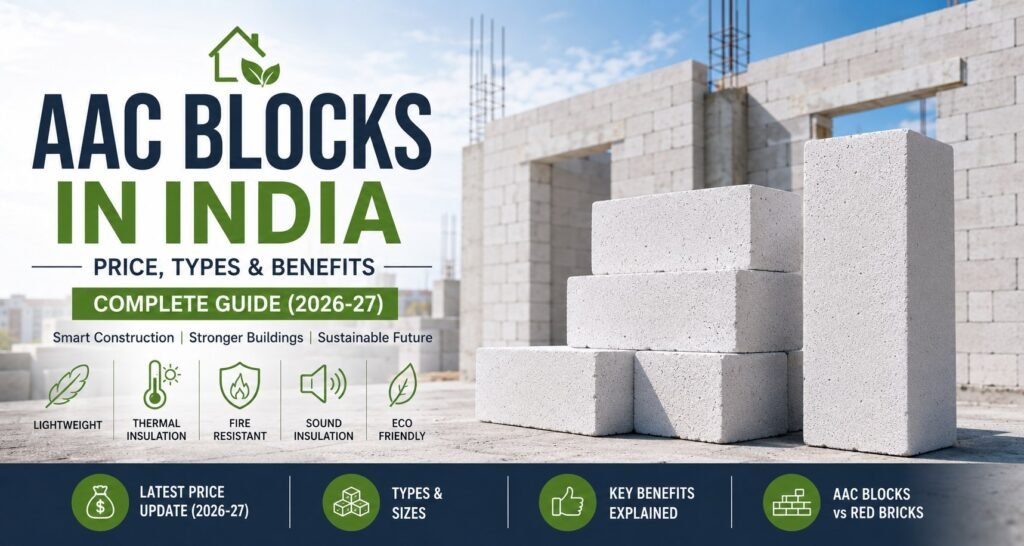
A client in Mohali recently asked us a question we hear constantly on construction sites: “Our contractor suggested switching from red bricks to AAC blocks — is that actually a good idea, or just a more expensive option?” It’s a fair question, and the honest answer is: it depends on how well you understand what AAC blocks are, where they perform best, and how to use them correctly. Get that right, and AAC blocks can reduce your construction cost, improve your home’s thermal comfort, and speed up your build significantly. Get it wrong — or use them where they’re not suited — and you’ve paid more for no advantage. This guide covers everything an Indian homeowner or contractor needs to know about AAC blocks in 2026-27 — from pricing and types to installation, myths, and the comparison with red bricks that everyone eventually asks for. What Are AAC Blocks? AAC blocks are lightweight, precast building blocks used in the construction of walls, partitions, and non-load-bearing structures. They are manufactured from a mixture of natural raw materials — sand or fly ash, cement, lime, water, and a small quantity of aluminium powder — that undergoes a controlled chemical reaction to create millions of tiny air pockets throughout the material. The result is a building block that is solid enough to carry wall loads, light enough to reduce the structural dead load on a building’s frame, and thermally efficient enough to meaningfully reduce heating and cooling costs in finished homes. AAC blocks were first developed in Sweden in the 1920s and have been widely used in Europe for decades. In India, adoption accelerated from the 2010s as awareness grew among architects and builders — and as fly ash availability from thermal power plants made local manufacturing cost-competitive. Today, AAC blocks are one of the fastest-growing building material categories in India, and for good reason. Full Form of AAC Blocks AAC stands for Autoclaved Aerated Concrete. Breaking that down: Autoclaved — the blocks are cured in a pressurised steam chamber called an autoclave, which gives them their final structural strength Aerated — the aluminium powder reacts with the cement and lime slurry to release hydrogen gas, creating a fine cellular structure of air pockets throughout the block Concrete — the base material is a cementitious mixture, giving AAC blocks their structural integrity This manufacturing process is what distinguishes AAC blocks from conventional hollow blocks or fly ash bricks — and it’s the source of most of their performance advantages. Why Are AAC Blocks Becoming Popular in India? The shift toward AAC blocks in Indian residential and commercial construction is not a passing trend. It is driven by four structural changes in the construction environment: ✅ Rising labour costs have made the speed advantage of AAC blocks — larger size means fewer units to lay — increasingly valuable. A walling crew can cover 30–40% more area per day with AAC blocks than with conventional bricks, directly reducing labour bills. ✅ Urban heat island effect in Indian cities has made thermal performance a genuine priority. Homeowners in cities like Delhi, Ahmedabad, Pune, and Chennai are paying real electricity bills for air conditioning that AAC blocks can meaningfully reduce.✅ Green building certifications — GRIHA, IGBC, and LEED — increasingly required for commercial projects, award points for AAC block usage due to the material’s lower embodied energy and use of industrial by-products like fly ash. ✅ Fly ash availability from India’s thermal power plants has made raw material supply reliable and cost-stable for AAC block manufacturers across most of the country, keeping prices competitive. Types of AAC Blocks Not all AAC blocks are the same. Understanding the types available helps you specify the right product for each application in your project. A) Based on Density Grade Grade Density Best Use Grade 2 (D2) 451–550 kg/m³ Non-load-bearing partition walls Grade 4 (D4) 551–650 kg/m³ External walls, general walling Grade 6 (D6) 651–750 kg/m³ Load-bearing walls, high-strength applications For most Indian residential projects, Grade 4 (D4) AAC blocks strike the best balance of weight, strength, and thermal performance. Grade 2 is used where maximum weight reduction is the priority — upper floor partitions in high-rise buildings, for example. B) Based on Raw Material ✅ Sand-based AAC blocks: Use fine river sand or quarry sand as the silica source. Common in South India and regions where fly ash is less available. Slightly denser and heavier than fly ash variants. ✅ Fly ash-based AAC blocks: Use fly ash — an industrial by-product from coal-fired power plants — as the primary silica source. More common in North and Central India where thermal power plants are concentrated. Considered more sustainable due to industrial waste utilisation. C) Based on Application ✅ Standard wall blocks: The most widely used type for external and internal walls in residential construction. ✅ AAC panels: Factory-produced panels used for floor and roof applications, significantly reducing construction time on multi-storey projects. AAC Block Sizes Available in India AAC blocks are available in a range of standard sizes. The most commonly used dimensions in Indian residential construction are: Length (mm) Height (mm) Width / Thickness (mm) Common Application 600 200 100 Internal partition walls 600 200 150 Internal walls, lighter external walls 600 200 200 Standard external walls 600 200 225 External walls in cold climates 600 200 250 High thermal performance external walls 600 200 300 Maximum insulation, special applications The 600 × 200 × 200 mm block is the most widely specified size for external walls in residential projects across North India, including the Chandigarh Tricity region. Note: Custom sizes are available from most manufacturers for specific project requirements. Always confirm availability and lead times before finalising specifications. AAC Block Price in India (2026-27) AAC block prices vary by density grade, block size, manufacturer, and location. The following are current market estimates for 2026-27: Block Thickness Price per Block (approx.) Price per Cubic Metre (approx.) 100 mm ₹28 – ₹38 ₹2,800 – ₹3,800 150 mm ₹38 – ₹52
House Construction in India: Complete Guide to Cost, Planning & Design (2026)

Introduction Last month, a family from Lucknow called us with a question we hear almost every week: “We have a plot, some savings, and absolutely no idea where to start.” That question — simple on the surface — hides a dozen decisions that will shape the next 30 years of their lives. How much will it actually cost? Which contractor do you trust? Do approvals take months or years? What does Vastu say about the kitchen direction? This guide answers all of it — honestly, specifically, and in the order you’ll actually face these decisions. It’s written from over a decade of active practice across residential projects in North India, combining real house construction data, current 2026 material costs, and the lessons that only come from watching hundreds of families move through this process. If you’re planning to build a home in India in 2026, bookmark this page. You’ll come back to it. Why 2026-27 Is a Critical Year for House Construction in India India is in the middle of a residential construction surge. Government initiatives like the Pradhan Mantri Awas Yojana (PMAY), rising urbanisation in tier-2 and tier-3 cities, and a steady return of NRI investment in Indian real estate have pushed housing construction to one of its most active periods in a decade. At the same time, house construction costs have risen sharply. Cement prices have increased 12–18% since 2023. Steel prices remain volatile. Skilled labour costs have gone up in most states. The homeowners who are navigating this environment most successfully are the ones who planned with current data — not assumptions from three or four years ago. This guide uses 2026-27 cost estimates sourced from active projects and current market rates. Step 1: Understanding the Full Cost of House Construction in India The first number most people want is cost per square foot. It’s a useful starting point — but only a starting point. House Construction Cost per Sq Ft in India (2026) Construction Grade Cost per Sq Ft Total for 1,000 Sq Ft Total for 1,500 Sq Ft Basic / Economy ₹1,600 – ₹2,000 ₹16L – ₹20L ₹24L – ₹30L Standard ₹2,100 – ₹2,800 ₹21L – ₹28L ₹31.5L – ₹42L Premium ₹3,000 – ₹4,500 ₹30L – ₹45L ₹45L – ₹67.5L Luxury ₹5,000+ ₹50L+ ₹75L+ These figures cover the structure, basic finishes, electrical, plumbing, and flooring. They typically exclude: Land cost Architect and structural engineer fees (usually 3–8% of project cost) Government approvals and permit fees (varies significantly by state and city) Interior furnishing Utility connection charges (water, electricity, sewage) Landscaping and boundary wall A practical rule: budget your total project cost at 1.3–1.4× the raw construction estimate to account for the above items and an unavoidable contingency buffer. State-Wise Cost Variation Construction costs vary significantly across India — here’s a realistic picture: Metro cities (Mumbai, Delhi, Bengaluru, Chennai): ₹2,800 – ₹5,000+ per sq ft North India (Punjab, Haryana, UP — including Chandigarh Tricity): ₹2,000 – ₹3,500 per sq ft South India (Tier-2 cities): ₹1,900 – ₹3,200 per sq ft Tier-3 cities and smaller towns: ₹1,600 – ₹2,500 per sq ft Labour costs account for roughly 30–35% of total house construction cost in most residential projects. States with higher daily wage rates — Maharashtra, Karnataka, Delhi NCR — will consistently sit at the higher end of these ranges. Step 2: Legal Approvals and Permissions This is the step most homeowners underestimate, both in time and complexity. Skipping or rushing approvals is the single most common source of legal problems years after a house is built. Key Approvals Required for House Construction in India ✅ Building Plan Approval (BPA) Required in almost all municipal areas. You’ll submit your architectural drawings to the local municipal body — Municipal Corporation, Development Authority, or Gram Panchayat depending on your location. Processing time ranges from 2 weeks to 6 months depending on the city and the complexity of your application. ✅ Commencement Certificate Issued after BPA — legally permits you to break ground. Some municipalities issue this automatically with the BPA; others require a separate application. ✅ NOC from Fire Department Mandatory for buildings above a certain height (typically G+3 and above) in most states. ✅ Environmental Clearance Required for larger projects and in environmentally sensitive zones. Not typically required for individual residential plots under 20,000 sq ft. ✅ Occupancy Certificate (OC) Issued after home construction is complete and the building is inspected. This is the document that legally makes your house habitable. Without it, many banks will not issue home loans, and resale becomes complicated. Many homeowners neglect to obtain this — a serious error. Practical tip: Hire a local architect who is familiar with your specific municipal body’s approval process. The informal knowledge of how a particular office processes applications is genuinely valuable and can cut approval timelines significantly. Step 3: Choosing the Right Floor Plan for Plot and Family The floor plan is not just an aesthetic choice — it determines how comfortably your family will live in the house for decades. Three decisions shape this more than anything else: A) Plot Shape and Orientation Before selecting a floor plan, understand what your plot actually allows. Key parameters: FAR / FSI (Floor Area Ratio / Floor Space Index): The maximum built-up area you’re permitted as a multiple of plot area. Varies by city and zone — check with your local authority. Setback requirements: Mandatory open spaces on all sides of the building. These reduce your actual buildable footprint. Road-facing direction: A north or east-facing main entry is both architecturally preferred for natural light and Vast-compliant. b) Layout Options by Plot Size ✅ Up to 800 sq ft plot: 1 BHK or compact 2 BHK with vertical expansion (G+1 or G+2) is typically the most practical approach. ✅ 800–1,200 sq ft plot: The sweet spot for a well-proportioned 2 BHK or 3 BHK on a single floor. The key is avoiding excessive corridor space — every square foot of passageway is a square foot taken from a room.